


Introduction
In the competitive world of Software as a Service (SaaS), having a high-converting SaaS landing page can make all the difference between a visitor who bounces and one who becomes a loyal customer. Your landing page is often the first impression potential customers have of your product, and it’s your best opportunity to convey the value of your solution, build trust, and drive conversions.
Crafting a landing page that resonates with your audience and encourages action is both an art and a science. From compelling headlines to strategic call-to-actions (CTAs), every element plays a crucial role in guiding visitors toward the desired outcome.
In this blog post, we’ll break down the anatomy of a high-converting SaaS landing page. We’ll explore each essential component, providing actionable tips and best practices to help you create a landing page that not only captures attention but also converts visitors into paying customers.
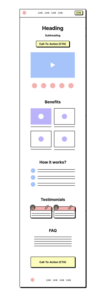
1. The Navbar: Streamlined and Focused
The navbar is the first element visitors encounter on your landing page. It should be clean, minimalistic, and focused on guiding users to take action.
Main Links Only: Limit your navbar to essential links such as Home, Features, Pricing, and Contact. Avoid cluttering it with unnecessary options that could distract visitors from your primary message.
Sticky CTA: Incorporate a sticky CTA (Call-to-Action) button that remains visible as users scroll down the page. This constant reminder can nudge visitors to take the next step, whether it’s signing up for a trial or scheduling a demo.
Tip: Use contrasting colors for your CTA button to make it stand out against the rest of the navbar.
2. Hero Section: Capture Attention Immediately
The hero section is the centerpiece of your landing page. It’s where you make your first impression and convince visitors to stay and learn more about your product.
Headline: Your headline should clearly articulate your Unique Selling Proposition (USP). It should answer the questions: What are you selling? Why should visitors care? Use benefit-driven language that resonates with your target audience. For example, instead of saying “Our software is powerful,” say “Boost your productivity with our all-in-one software.”
Subheading: Expand on your headline with a subheading that provides additional context. This is your chance to explain what makes your product unique and why it’s worth exploring further.
Call-to-Action (CTA): Position a prominent CTA button beneath your headline. This button should guide visitors on the next step you want them to take, such as “Start Your Free Trial” or “Get a Demo.”
Tip: Consider including a short video or animation in the hero section to visually demonstrate your product’s value. Keep it concise—2-3 minutes max.
3. Social Proof: Build Trust Instantly
Social proof is a powerful tool for building credibility and trust with your audience. By showcasing endorsements from satisfied customers, industry leaders, or reputable brands, you can reassure visitors that your product delivers on its promises.
Testimonials: Display testimonials from happy customers who have seen tangible results from using your product. Include names, job titles, and company logos to add authenticity.
Case Studies: If applicable, provide links to case studies that detail how your product helped specific customers achieve their goals.
Logos of Prestigious Clients: If your product is used by well-known companies, feature their logos prominently on your landing page. This is a quick way to establish trust with new visitors.
Tip: Include quotes from industry experts or influencers who have endorsed your product. Their credibility can significantly boost your landing page’s persuasive power.
4. Benefits Section: Sell the Outcome, Not the Features
While features are important, benefits are what really sell your product. In this section, focus on the outcomes your users can expect when they use your product.
Visual Layout: Organize your benefits in a visually appealing layout, such as a grid or set of cards. Each benefit should have a brief description accompanied by an icon or image that illustrates the point.
Benefits Over Features: Phrase your benefits in terms of how they solve pain points or improve the lives of your users. For example, instead of “Real-time analytics,” say “Make data-driven decisions instantly.”
Tip: Limit your benefits to 3-5 key points that directly address your users’ most pressing needs. Too many benefits can overwhelm the visitor and dilute the impact of your message.
5. How It Works: Simplify Your Product's Functionality
The How It Works section breaks down your product’s functionality into simple, digestible steps. This helps visitors understand how your product fits into their workflow and why it’s worth using.
Step-by-Step Guide: Outline your product’s process in 3-5 steps. Use short, punchy bullet points or numbered lists to keep the information concise and easy to follow.
Supporting Visuals: Include diagrams, screenshots, or animations that visually represent each step. This makes the information more engaging and easier to comprehend.
Tip: Use language that is easy to understand, avoiding technical jargon. The goal is to make your product’s value crystal clear, even to those who may not be familiar with the technical details.
6. Testimonials: Real Voices, Real Impact
Returning to the theme of social proof, a dedicated Testimonials section allows you to dive deeper into the experiences of your customers.
Detailed Testimonials: Feature longer testimonials that tell a story about how your product has made a difference. Highlight specific results or outcomes that the customer achieved.
Diverse Voices: Include testimonials from a variety of industries or use cases to show the versatility of your product.
Tip: Consider adding video testimonials. Seeing real customers speak about their positive experiences can have a powerful impact on prospective buyers.
7. FAQs: Address Common Concerns
The FAQ section is where you can address any lingering questions or concerns that potential customers may have. This is your opportunity to clear up doubts and provide the information needed to move forward with confidence.
Common Questions: List the most common questions your prospects ask, such as pricing details, integration capabilities, or customer support options.
Concise Answers: Provide clear, concise answers that are easy to scan. If a question requires a more detailed explanation, consider linking to a blog post or a help center article.
Tip: Regularly update your FAQs based on feedback from your sales and support teams. This ensures that the section remains relevant and addresses the most current concerns.
8. Final Call-to-Action (CTA): The Last Push
Your landing page should culminate in a final CTA that encourages visitors to take action. This is your last opportunity to convert a visitor into a lead or customer, so make it count.
- High Contrast: Ensure the final CTA button stands out visually with a high-contrast color that grabs attention.
- Action-Oriented: Use action-oriented language that conveys urgency or appeal, such as “Start Free Trial Now,” “Join Us Today,” or “Schedule Your Demo.”
Tip: Consider offering an incentive for taking immediate action, such as a discount or bonus feature for signing up right away.
9. Footer: Close with Confidence
The footer of your landing page is often overlooked, but it plays an important role in reinforcing trust and providing additional resources.
Essential Links: Include links to important pages such as your privacy policy, terms of service, contact information, and social media profiles.
Logo and Copyright: Display your company logo and copyright information to establish professionalism.
Email Sign-Up: If applicable, include a sign-up form for your newsletter or updates. This can be a valuable way to capture leads who aren’t ready to convert immediately.
Tip: Keep the footer clean and uncluttered. It should serve as a resource, not a distraction
Conclusion: How to Build a High-Converting SaaS Landing Page
Building a high-converting SaaS landing page requires a strategic blend of compelling content, persuasive design, and clear calls to action. By focusing on the key elements outlined in this guide—navbar, hero section, social proof, benefits, how it works, testimonials, FAQs, CTAs, and footer—you can create a landing page that not only attracts visitors but also converts them into loyal customers.
Remember:
Less is more. Keep your landing page focused and free of distractions.
Benefits sell. Always highlight the value your product provides to users.
CTAs matter. Make sure your calls to action are clear, prominent, and action-oriented.
By applying these best practices, you’ll be well on your way to creating a landing page that drives results and helps your SaaS business grow. So go ahead, start building, and watch your conversion rates soar!
Need help getting started? Don’t hesitate to reach out for expert advice on designing a landing page that converts. Happy building!